More good news for super funds – are outflows to SMSFs flattening out?
27 January, 2015
There are all sorts of interesting nuggets in the ATO’s SMSF data for the 2013 year released just prior to Christmas.
Beyond showing how expensive SMSFs are, the data also shows 2013 as the weakest year for net inflows to SMSFs since at least 2006. Net inflows in 2013 were $10.2bn, down from $16bn in 2012, and less than half of the $20-30bn pa we were seeing in 2008-9.
The cashflow component that should most interest APRA funds is transfers to SMSFs. Transfers from APRA funds to SMSFs have been >$15bn pa since 2008. They don’t have much impact on APRA fund member numbers, but have had an increasingly material impact on net cashflows.
Many APRA funds, retail and not-for-profit, have experienced rapid growth in outflows to SMSFs, and for some it’s the biggest destination in dollar terms. But is the drain to SMSFs getting worse? Being able to answer that question leads to decisions about whether and how to respond.
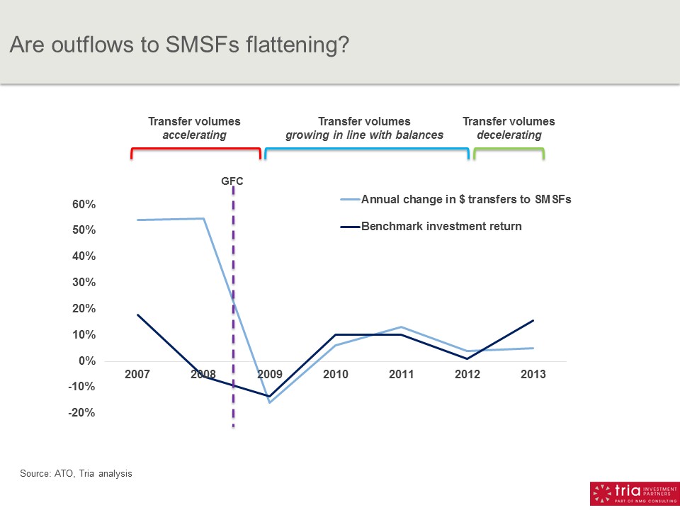
Todays’ chart offers a perspective. If we look at how transfers to SMSFs are moving in relation to investment returns, we can assess whether the SMSF penetration of of APRA funds is advancing or retreating. It shows:
– Annual % change in $ transfers to SMSFs (light blue line).
– Annual investment return (we’ve used AustralianSuper as a benchmark; dark blue line)
How do we interpret this chart?
If transfer activity to SMSFs is consistent over time, you would expect the lines to be closely converged. For example if there is a +10% investment return in a year, all things equal you would expect SMSF transfers to grow by ~10%, because the outgoing balances from the APRA funds are now 10% bigger. It won’t be a perfect match of course because of contributions and other factors, but it should be reasonably close.
What about when there are divergences between the lines?
– When the light blue line is well above the dark blue line (2007-8), transfers to SMSFs are rising by much more than explained by investment returns; ie the rate of transfer activity is accelerating.
– Conversely, when the dark blue line is higher (2013), transfers to SMSFs are rising by much less than investment returns, implying that SMSF transfer activity is subsiding.
This tells a fascinating story of three distinct phases:
– 2007-8: prior to the GFC, SMSFs were rapidly increasing their penetration of APRA funds.
– 2009-12: the onset of the financial crisis appears to have choked this off. Transfers to SMSFs moved closely in line with investment returns in this period, indicating that the rate of penetration had stabilised. Not getting better for APRA funds, but no longer falling off a cliff.
– 2013: hints of improvement. Growth in transfers to SMSFs was well under investment returns, suggesting that the rate of penetration had fallen. For APRA funds, the SMSF situation actually got better in 2013 for the first time since 2006.
It’s a nuanced view, but gives cause for optimism for APRA funds competing with SMSFs. On our analysis, things have not been getting materially worse since 2009, with 2013 a year of competitive improvement.
Of course it’s just one year and it could be a blip. And as this view is in dollar terms, it may reflect a similar number of members on the move to SMSFs in 2013, but with lower average balances (although this is still a positive for net cashflows).
Overall, this view implies it’s not a burning platform calling for drastic responses. But there’s an ongoing smoke signal in the steady outflow of APRA fund members to SMSFs of ~60,000 pa, pointing to enduring underlying issues around control and flexibility that APRA funds do need to address.